Goal and Specs Used in Development Pass-Off
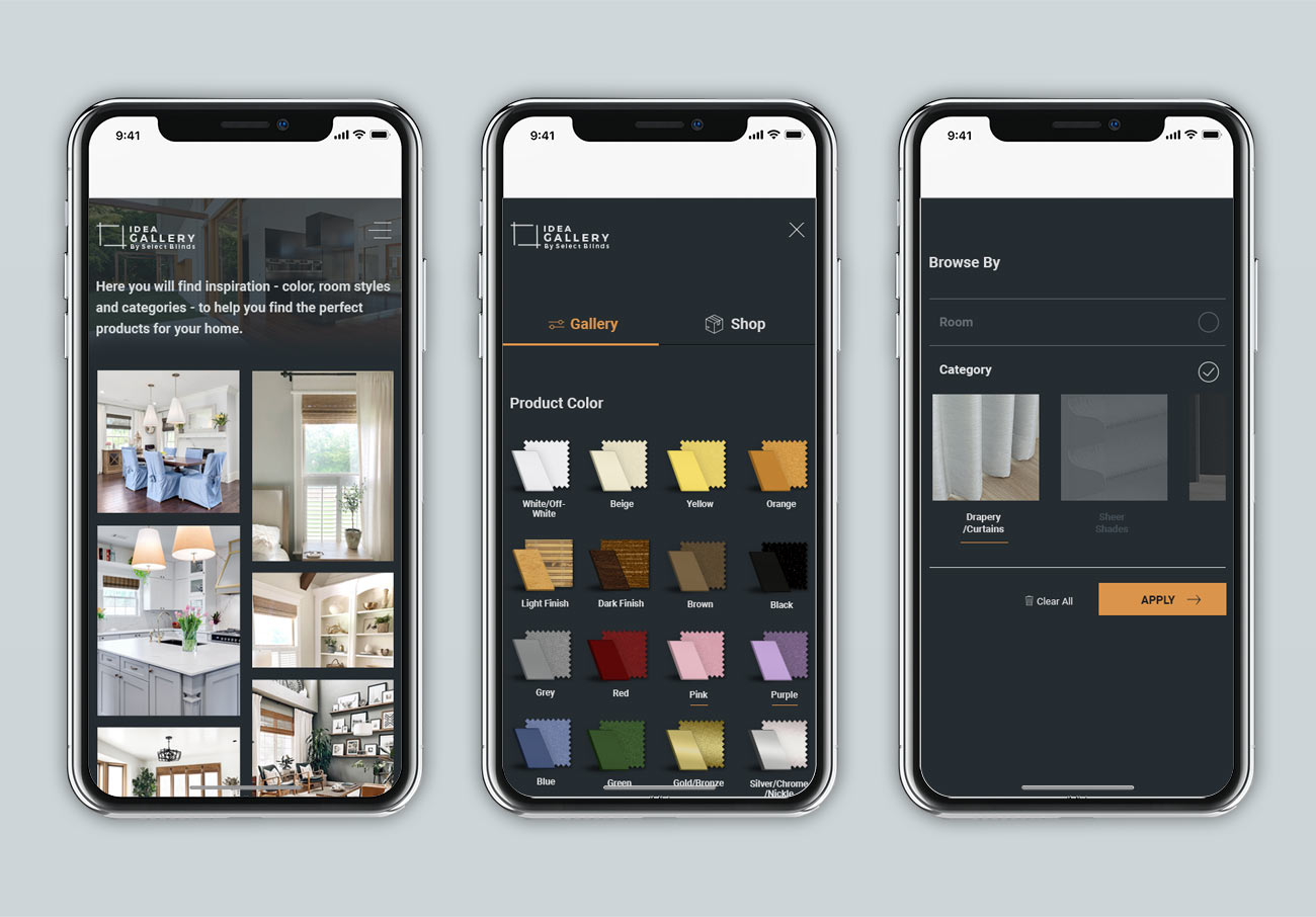
To be beautiful and inspire users was at the center of this design. To shop the products and picture the products in their homes was important. Created a new website to showcase photos in a gallery UI.
I’d wanted to focus a lot of attention the rollover and transitions states. The design is ultra simple and clean with a lot of straight thin lines. This site simplifies the language down to more abstract visuals, symbols and text.
Landing page gets right into the photos with a short intro (intro animates up into place) – the background image: green trees offsets the open white space with windows and glass doors in the background that offer a hint of the space they decorate in.
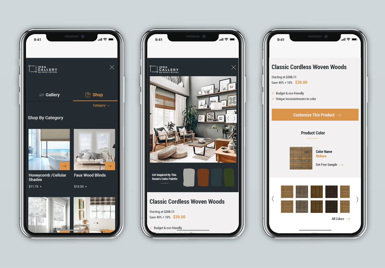
Image Zoom/Product Details: this will fly out with a smooth animation from the left and is scroll-able. Each section (details, image, product color) will transition into place upon opening and navigation to next/back. The menu icons will animate (the two outer lines cross and the middle line fades) into an X. All three CTA’s will open a new tab to the relevant pages (Product page, with the color selected/to the product page with the free sample selected/to the product page anchored to the color step).
Menu fly-out will have an animation – pushes out from the left and covers entire site and is scroll-able. As with the Image Zoom, the content underneath push out of view from left to right too. It was important that there was really only “one page” and any other interaction was over the photo grid. The Menu/fly-out is so popular in modern designs. I wanted to give landing page a clean and clear navigation; there’s a menu to filter so here is this wide open landscape to scroll and view photos – that’s it and enjoy.


